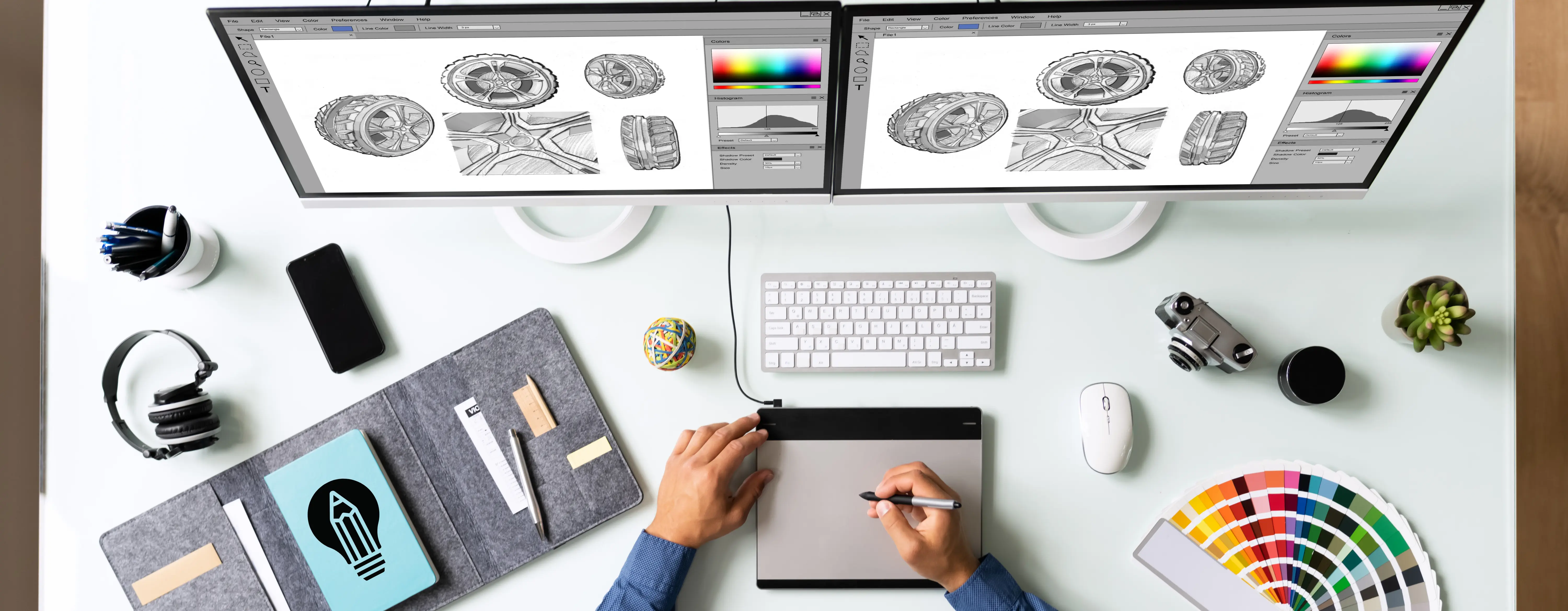
O mundo da comunicação visual está em constante evolução na interseção da tecnologia, dinâmicas culturais e hábitos de consumo. A partir de 2026, a abordagem de design afastou-se da busca pela pura perfeição estética e evoluiu para um ponto mais humano, intencional e focado na sensação de "presença". Esta nova linguagem visual, desenvolvida como uma resposta reflexiva a ambientes digitais cada vez mais sintéticos, abriga filosofias estruturais que abraçam imperfeições e priorizam experiências cinéticas e táteis.
A integração da inteligência artificial (IA) no setor não é mais uma novidade ou um atalho como nos anos anteriores. Agora é um colaborador generativo que expande a visão do designer e oferece composições surpreendentes. Estamos entrando em uma era onde a tipografia se liberta de grades rígidas e se flexiona, as fotos ultrapassam molduras previsíveis e o minimalismo é redefinido com confiança em vez de restrição. As marcas que desejam alcançar o sucesso sustentável devem ler estrategicamente esses novos códigos visuais e integrá-los em seus projetos em todos os campos, desde interfaces até identidades corporativas.
A Interseção Impecável da Tecnologia e do Toque Humano
As práticas de design estão evoluindo em uma direção onde o espectador deixa de ser um consumidor passivo e se transforma em um experimentador interativo. Por mais autônomas que as ferramentas se tornem, a seletividade e a inteligência emocional do fator humano continuam a formar a espinha dorsal principal dos projetos. Uma das dinâmicas mais críticas que determinam a visão de 2026 é a mistura da perfeição oferecida pelo digital com o calor abrigado pelo mundo analógico.
Em 2026, o design deixa de ser um banquete puramente visual e se transforma em uma engenharia de sistema intencional que passa os limites de percepção expandidos pela IA através dos filtros estéticos da alma humana.
O denominador comum de interfaces modernas, materiais impressos e identidades de marca é rejeitar a desordem enquanto aumenta a profundidade. Abaixo, você pode examinar as principais tendências que estão reescrevendo os padrões do setor e transformando as percepções estéticas.
Principais Tendências de Design que Moldam 2026
Destacar-se no mercado digital altamente competitivo não é mais possível apenas com boa aparência; é possível construindo um sistema visual consistente, memorável e funcional. Vamos detalhar as tendências fundamentais que moldam os projetos do futuro.
1. IA Generativa e Integração 3D
Nos processos criativos, a IA é usada para descobrir formas e texturas que rompem limites. Embora composições surreais atraentes sejam geradas rapidamente pela IA, o toque final e a decisão editorial sempre pertencem ao designer. Por outro lado, os designs tridimensionais (3D) perderam sua ostentação hiper-realista e exaustiva dos anos anteriores, tornando-se componentes mais estilizados, suaves e estratégicos que adicionam profundidade às interfaces.
🤖 Dica: A Arte de Filtrar a Tecnologia
Evite usar resultados de IA em sua forma bruta. Adicione "autenticidade" misturando os recursos visuais gerados com a paleta de cores, tipografia e história da sua marca. A originalidade ainda é a moeda mais valiosa.
2. Clareza Modular: Grades Bento (Bento Grids)
Os layouts estilo Bento referem-se à apresentação de conteúdo em caixas que não são excessivamente rígidas, mas tremendamente organizadas. Inspirada nas lancheiras japonesas, essa estrutura estabelece uma hierarquia impecável, principalmente em telas digitais (em transições mobile e desktop). O espectador pode consumir facilmente cada seção dentro de seu próprio espaço autônomo sem ser bombardeado com informações.
| Filosofia de Design | Abordagem do Passado | Visão 2026 (Futuro) |
|---|---|---|
| Ordem e Hierarquia | Grades Clássicas Rígidas e Inflexíveis | Bento Grid: Caixas Modulares, Flexíveis e Equilibradas |
| Branding | Logotipos e Ícones Estáticos e Sem Movimento | Identidades Rítmicas, Focadas em Movimento (Motion-Led) |
| Tipografia | Fontes Rígidas e Neutras Focadas na Legibilidade | Estruturas Líquidas e com Armadilhas de Tinta (Ink Trap) |
| Estética Visual | Perfeição e Nitidez Digitais | Técnica Mista, Colagem e Imperfeições Intencionais |
3. Branding Focado em Movimento (Motion-Led Branding)
A era dos logotipos estáticos está chegando ao fim rapidamente. Em 2026, as marcas constroem movimento e ritmo como parte fundamental de suas identidades. Microanimações, tipografias que se transformam e sistemas dinâmicos que reagem à rolagem na tela visam estabelecer um vínculo instantâneo com o espectador. O movimento deixou de ser uma ferramenta de enfeite e se transformou em uma linguagem de comunicação que reflete diretamente a personalidade da marca.
4. Tipografia Líquida e Armadilhas de Tinta (Ink Traps)
A "Tipografia Líquida" (Liquid Typography), onde as letras deixam de ser símbolos estáticos e esticam, fluem e mudam de forma de acordo com o tom emocional do visual, cria um efeito marcante, principalmente em títulos e campanhas. Simultaneamente, os cortes "Ink Trap" (Armadilha de Tinta), usados anteriormente apenas para melhorar a qualidade de impressão, continuam sua ascensão como uma escolha estética que adiciona ritmo e um charme industrial característico às letras de hoje.
Neo-Brutalismo e Minimalismo Assertivo
Livre de decorações excessivas, dominado por grandes tipografias e contrastes nítidos, o Neo-Brutalismo exibe uma postura autoritária e confiante. Colocando a função antes da forma (Utilitário), esta abordagem é a principal escolha para marcas que desejam transmitir sua mensagem de forma direta e intransigente.
5. Técnica Mista (Mixed-Media) e o Retorno da Tatilidade
Na era da fadiga digital; designs onde recortes de papel, desenhos à mão, fotografia e texturas granuladas se entrelaçam (Mixed-Media & Collage) oferecem uma profunda sensação de relaxamento. Estas estruturas, onde imperfeições são intencionalmente deixadas e formas orgânicas (Inspiradas na Natureza) e tons de terra são usados, sussurram mensagens de sustentabilidade e honestidade como um subtexto para o espectador.
6. Desfoque, Distorção e Atmosfera (Blur & Distortion)
Existem momentos em que a clareza nem sempre é necessária. Designs onde transições de cores (Gradients) são suavizadas, bordas de objetos são intencionalmente borradas ou ruído digital (Glitch) é adicionado são ferramentas exclusivas para criar uma atmosfera emocional, nostalgia ou uma sensação de tensão. Essas técnicas visam oferecer ao espectador um "clima" em vez de apenas mostrar uma fotografia.
💡 Dica: Liberte as Fotos das Molduras
Tire os recursos visuais das formas usuais de 16:9 ou quadradas. Fotos cortadas em formas personalizadas (Custom Shapes) deixam de ser apenas conteúdo e tornam-se uma parte ativa e rítmica da composição da página.
Conclusão: Uma Abordagem de Design que Prioriza o Significado
O denominador comum de todas essas tendências examinadas é o distanciamento da ostentação para se inclinar a escolhas estratégicas que têm uma razão sólida por trás. Quer você construa um mundo retrofuturista com cores neon ou entregue uma mensagem massiva de uma palavra com minimalismo ousado; os trabalhos mais bem-sucedidos de 2026 serão projetos que usam a tecnologia sem se tornarem escravos dela, tocam a psicologia humana e evitam a desordem. Os movimentos de design não são regras, mas um vocabulário rico a ser usado ao falar com seu público-alvo; quais palavras você escolhe depende da história que deseja contar.